Somewhere between your first real job and your thirtieth birthday, your closet quietly staged a coup. Black, navy, gray, and “safe” won. It happens to almost every guy. You get busy, you get a career, and you start dressing for meetings instead of for yourself. Before you know it, you own fourteen near-identical button-downs and a wardrobe that could pass for a funeral home’s dress code.
Here’s the thing nobody tells you: that “safe” wardrobe isn’t actually safe. It’s just invisible. But invisible isn’t the same as sharp and it definitely won’t help you stand out. Choosing colors to wear for men in their 30s may feel too experimental and challenging, but you can easily add a few wardrobe items to make you stand out without looking silly.
The Neutral Trap
Neutrals are easy. They match everything, they hide stains, and nobody has ever been fired for wearing gray. But flat neutrals aren’t always the most flattering and can wash you out and make you blend into every room you walk into.
Think about the last time someone complimented your outfit. Chances are it wasn’t the fourth gray sweater. It was the one time you wore that burgundy jacket or the olive chinos that you might have been worried were doing too much.
The right color can brighten your face, make your eyes pop, and even make you look leaner or more athletic. The wrong color (or the absence of any color at all) can make you look tired, older, or washed out. Once you’re past 30, this matters more, not less.
What’s Actually in Style Right Now
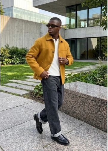
Menswear has swung hard away from “safe” back toward personality, but it’s a controlled kind of boldness rather than an anything-goes free-for-all. A few things worth knowing:
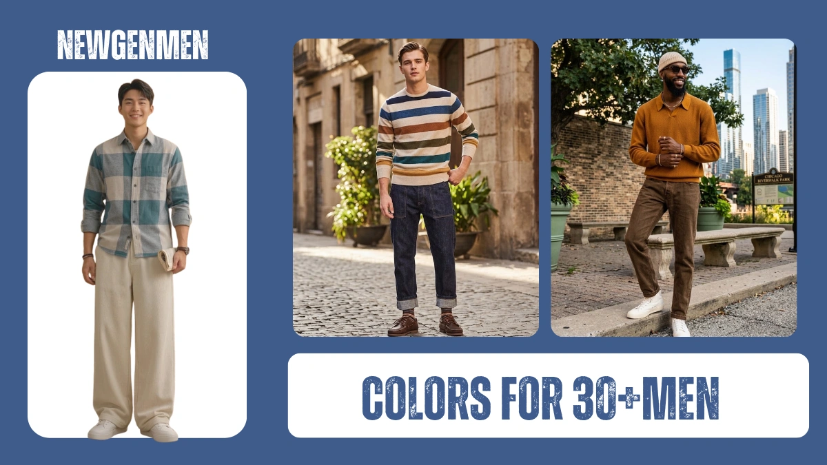
Designers and stylists are calling it a “quiet rebellion.” Instead of a wardrobe full of unrelated bright colors, the move is monochromatic dressing and accent colors, building an entire outfit around different shades of the same color, like teal on teal or head-to-toe olive or wearing neutral colors and adding a little color pop.
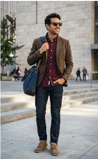
Earth tones with depth are everywhere this year: clay browns, moss green, burnt sand, muted rust, and deep stone gray. The trick with these is texture. A matte cotton pant with a brushed wool jacket in the same color family looks expensive and deliberate, not flat.
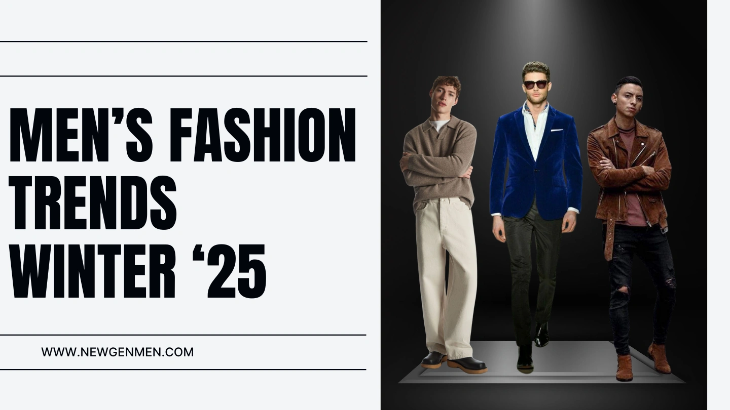
At the same time, there’s real appetite for bold, saturated color, especially deep reds, buttery yellows, cobalt blue, and rich teal, which has been getting plenty of attention as one of the year’s defining shades. Velvet and corduroy jackets in jewel tones like rust, mustard, and indigo are having a moment too, especially for evening and colder-weather looks.
Have Some Fun With Prints Too
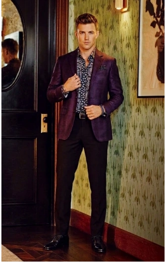
Color is only half the equation. Patterns are the other easy way to add personality without saying a single word, and a lot of men skip them entirely just because they never learned how to wear one without feeling like a walking tablecloth.
Here are some of the easiest patterns to start with, and how to keep them wearable. Just remember to stick to one pattern per outfit unless you really know what you’re doing (pattern mixing, like stripes with plaid, is an advanced move best saved for guys who’ve already nailed the basics).
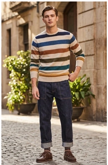
Stripes are the most forgiving place to start. Vertical stripes elongate your frame, which makes them a great option if you’re broader or shorter, while horizontal stripes add width, so use them more sparingly if that’s not the effect you want. A subtle pinstripe shirt under a solid blazer looks sharp for work, while a wider, bolder stripe on a linen shirt feels right for a summer weekend.
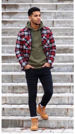
Flannel and plaid have been a cold-weather staple forever, but they’ve quietly become a go-to for elevated casual wear too. The key is scale and color. A small, muted plaid in earth tones (think rust and olive) reads as refined, while a large, high-contrast buffalo check leans more rugged and casual. Layer a flannel shirt under a plain crewneck sweater, or wear it open over a tee like a light jacket.
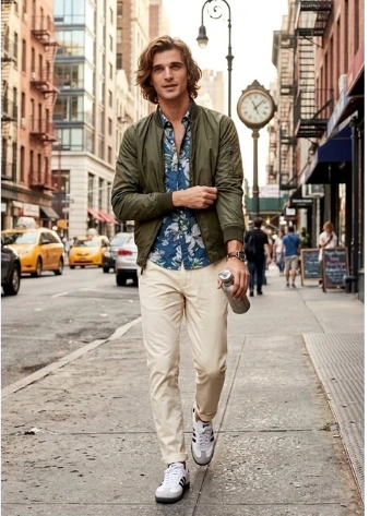
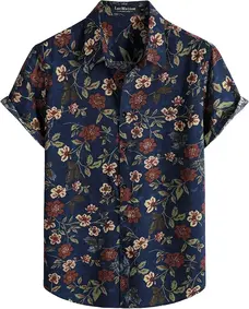
Subtle florals and paisley are having a real moment, and they’re not just for warm-weather resort wear anymore. The trick is keeping the print small-scale and the color palette muted rather than bright and cartoonish. A shirt with a subtle print to add a little accent color pop to a more neutral outfit like a shirt under a dark blazer or a pocket square or tie.
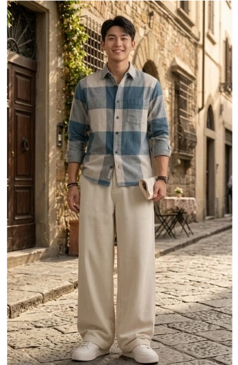
Checks and gingham sit somewhere between stripes and plaid. They’re a little more playful than a pinstripe but more buttoned-up than flannel, which makes a gingham shirt a great option for a business casual day or a lunch date. Smaller checks look cleaner and more versatile; larger checks feel more casual and weekend-appropriate.
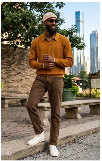
Textured knits count as a pattern too, even without an obvious print. Cable knits, waffle knits, and ribbed sweaters add visual interest through texture instead of color or print, which is a great low-risk entry point if bold patterns still feel intimidating.
Easy Outfits to Add a Little Color For Any Occasion
Casual Daytime: Casual work, coffee run, weekend errands,
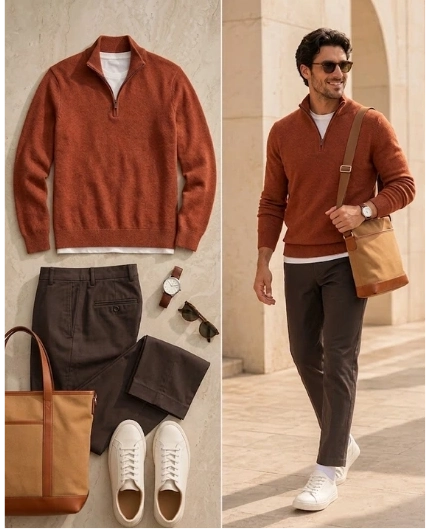
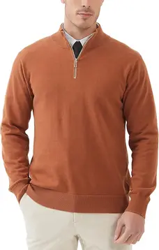
- Top: Rust orange or olive green quarter-zip sweater, layered over a plain white tee
- Bottom: Straight-leg khaki chinos (staying tonal with the dark orange rather than fighting it)
- Shoes: White leather sneakers, minimal branding
- Accessories: Brown leather watch, canvas tote or crossbody bag in a warm tan
This one leans into the tonal, earthy quarter zip trend without trying too hard. It looks like you got dressed on purpose, but it took you five minutes.
Top Amazon Pick:
Relaxed Daytime: Beach town, backyard hangout, low-key weekend
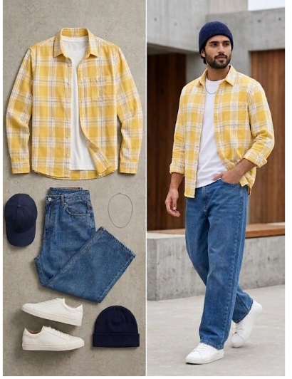
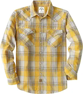
- Top: Plain white t-shirt, layered under an open yellow flannel shirt worn loose
- Bottom: Loose-fitting, relaxed jeans (nothing skinny or overly tailored here, the whole look is meant to feel easy)
- Shoes: White sneakers, clean and simple
- Accessories: A thin silver chain and a shell bracelet, kept subtle rather than stacked
The yellow flannel does all the work as a single pop of color against an otherwise simple white-and-denim base, while the jewelry adds just enough personality without looking overdone. It’s casual and stylish without looking lazy or slobbish.
Top Amazon Pick:
Business/Smart Casual: Client meeting, office day, dinner with colleagues
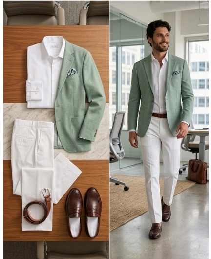
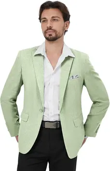
- Top: Light slate green blazer over a white button down shirt
- Bottom: Lighter colored dress pants like white, cream, or khaki
- Shoes: Brown leather derby shoes or loafers
- Accessories: Simple leather belt matching the shoes, a subtly patterned pocket square in a muted tone that pulls from the shirt color
This gives you one clear color statement (the blazer) against a calm, professional base. It stands out in a room of gray suits without looking like you didn’t get the office memo.
Top Amazon Pick:
Night Out: Date night, dinner, a bar with friends
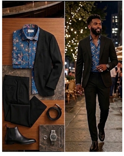
- Top: Blue, floral patterned button down worn casually under a sleek, dark blazer
- Bottom: Black or dark charcoal tapered trousers
- Shoes: Black leather boots or clean black sneakers, depending on the vibe
- Accessories: A statement watch, and don’t be afraid of a signet ring or simple chain if that’s your style. This is the outfit where a little more personality is welcome.
Keep the sleek and sophisticated, especially if it’s a date night, and add a subtle pop of color to add simple flair to your look. It’s fun, eye-catching, and appropriate for fancier dress code venues without being overly stuffy.
Top Amazon Pick:
Finding Your Flattering Colors
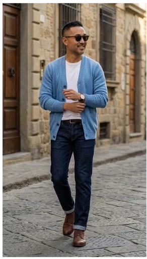
This isn’t about zodiac signs or personality tests. It comes down to basic color theory and matching tones to your skin’s undertone, plus a little common sense about body type.
If you have a warm undertone (veins look greenish, gold jewelry looks better on you than silver), you’ll generally look great in earthy, warm colors: rust, mustard, olive, terracotta, camel, and warm reds. These tones play well with your natural coloring instead of fighting it.
If you have a cool undertone (veins look bluish, silver jewelry flatters you more), lean into jewel tones and cooler shades: cobalt blue, emerald green, burgundy, plum, and true reds. Cool grays and icy blues also work well on you.
If you have a neutral undertone, congratulations, you basically won the color lottery. Most shades will work, though it’s still smart to test a few against your face in daylight before committing to a full outfit.
For darker skin tones, bright, saturated colors like cobalt, deep orange, fuchsia, and bold yellow tend to look incredible, since deeper skin can carry high-saturation color without looking washed out. Pastels can work too, but they read best in richer, dustier versions rather than baby-pale tints.
For lighter or fairer skin tones, softer, muted versions of colors (dusty blue, sage, soft terracotta, muted burgundy) tend to look more natural than neon-bright versions, which can overwhelm a lighter complexion.
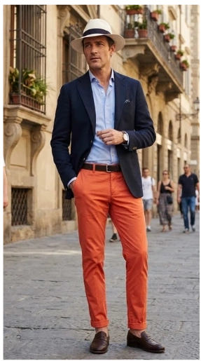
Body type plays a role too, though it’s more about proportion than restriction:
- If you’re broader or carrying more weight, vertical elements help elongate your frame: a solid, darker color on the bottom with a slightly bolder or lighter color up top draws the eye upward and creates a cleaner line. Avoid horizontal stripes in large scale, but a subtle pattern in a rich, darker tone can look sharp rather than busy.
- If you’re on the leaner or slimmer side, you can have more fun with brighter, bigger patterns and lighter colors, since they’ll add visual weight and dimension rather than overwhelming you.
- If you’re on the shorter side, monochromatic or tonal color-blocking (same color family, different shades, head to toe) creates a long, unbroken line that makes you look taller.
- If you’re taller, you can break things up more freely with contrasting colors on top and bottom without worrying about looking chopped up.
A Few Extra Tips For Colors for Men in Their 30s
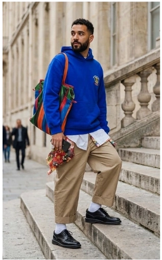
Start small if this feels like a big shift. You don’t need to overhaul your whole closet in one weekend. Buy one colored shirt, one colored jacket, or a pair of colored pants, and build outfits around the neutrals you already own.
Test colors in natural light before you buy, not just under store lighting, which can make everything look better (or worse) than it actually is. Hold a shirt up under your chin near a window. If it makes your skin look brighter and more alive, that’s a good sign. If it makes you look tired or sallow, skip it no matter how trendy it is.
And finally, fit still matters more than color. A perfectly fitted neutral outfit will always beat a baggy, ill-fitting colorful one. Get the fit right first, then use color to elevate it.
Thirty isn’t the end of taking style risks, it’s actually a great time to start taking the right ones and developing your signature style. You know yourself better now, you can afford better quality, and you’ve probably stopped caring what strangers think as much as you used to.
Also Read: